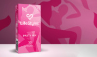
LifeStyles Condoms
Sexual pleasure transcends gender, race, identity. It’s about saying “no” to traditional thinking and saying “yes” to inclusivity and “yes” to consent. LifeStyles has been dedicated to sexual health advocation for decades. With such a long heritage in the sector, it was time for the brand and product packaging to be pulled into the relevant sexual wellness conversations of present day 2023.
Sector:
Sexual Wellness
Scope:
Brand Identity
Packaging Design
Brand Guidelines
Marketing Collateral
Setting the Scene
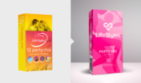
Established in 1905, LifeStyles is Australia and New Zealand’s most trusted sexual wellness brand, a global leader in the sexual wellness sector, producing a range of condom, personal lubricant and other related products. Through consumer-based market research, the current LifeStyles® brand and packaging was perceived as dated and hetero-orientated.
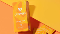
A refreshed Front-Of-Pack livery across their LifeStyles® condom range was needed to appeal to the Gen Z demographic, grab consumer attention within seconds, and maintain their safe and trustworthy brand association whilst increasing their credibility as a modern and socially/eco-minded brand.
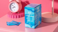
The ‘Aha!’ Moment
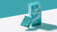
Discoveries during research found that colour influenced consumer decisions, not product titles. Taking this knowledge, we developed a series of bright block-colour illustrations capturing androgenous figures in the act of pleasure to bring the 8 SKU’s to life. Each illustration carefully blurs the lines of any discernible hetero-orientated visuals, placing the brand in the middle of today’s inclusive and diverse consumer landscape.
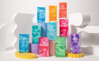
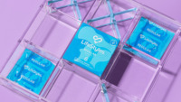
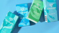
Creative Conclusions
The new packaging stands out on shelf and appeals to a broader audience, characterised with androgenous, ambiguous figures that can represent anyone. No matter how you identify with, there’s no pressure of having to fit neatly in one box.
Front of pack architecture was refined, and iconography developed to match the new brand direction, including messaging around sustainability and plastic-free packaging. The most important messaging on the box is consent, brought to the forefront on top of pack, reminding the consumer to think of ‘Yes’ as their biggest turn on.