Damaged Goods Distilling Co.
The distillery-disruptors making world-class spirits out of waste.
We first think of food waste as the scraps from our plates, but there’s immense value in what would be traditionally discarded. Damaged Goods Distillery Co. creates damn delicious spirits made from high quality produce that’s been given another lease on life – challenging the broken food system and engaging with the community in the process. In the crowded alcoholic beverage space, they needed to enhance their non-traditional disruptor brand status and make a bold entrance by standing out on shelf.
Sector: Food + Beverage
Services / Creative / Scope:
Brand Identity
Brand Strategy
Tone of Voice
Logo Design
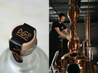
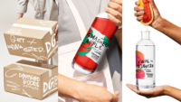
Packaging Design
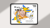
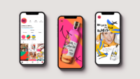
Website Design
“The food production and retail industries are broken. Approximately one-third of all food produced for human consumption around the world goes to waste, and Australians are even more wasteful than that. Customers should be able to make more environmentally choices while still enjoying a slice of luxury.”
Setting the Scene
Damaged Goods Distilling Co. is founded by Tim and Pia, two hospitality experts that are as passionate about the planet as they are about their palettes. As a new player in the alcoholic spirits industry, they put perfectly imperfect, flavour-packed waste streams to good use to create sustainable, yet super-premium spirits. The name was a great start, the taste – even better. The key was to grab consumers’ attention on shelf, and then educate them on why they are different. It’s time for food to also say “F your beauty standards”.
“We’ve been conditioned to judge things primarily based on appearance. From faces, to fashion, to fruits. However, if you really think about it, shouldn’t flavour and nutritional value be more important than how food should look? Damaged Goods Distillery Co. is here to challenge the norm of our broken food system. Giving food a fighting chance… at a second chance.”
The ‘Aha!’ Moment
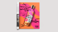
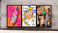
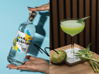
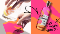
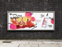
Playing off their brand name, premium-quality product, and disruptor identity, a street-smart aesthetic was developed. Positioning food waste as ‘the hero’, a series of custom illustrations were created, featuring one core ingredient drawn abstractly, a nod to the imperfectness of the ingredients. The brand direction was further fleshed out with custom street-art style typography and loosely drawn graffiti-style visual elements, reinforcing a bold street aesthetic. The tagline, Get Unwasted, captured the cheeky, energetic and honest persona of the brand, delivered with a playful and confident attitude.
Creative Conclusions
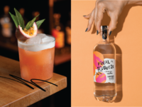
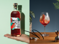
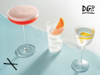
Using a bright and bold colour palette, the brand’s core attributes (passion, energy, approachability) shines through on shelf. Consumers are educated about “Forgotten Food, Memorable Spirits” so they can think of new ways to Get Unwasted. The packaging reflects a super-premium ‘slice of luxury’ yet celebrates the perfectly imperfect in all the details: an uncoated plantation managed stock, the black foil print, a wood and cork lid elevated by a pure black cap label, a rose gold copper foil treatment.